I was very excited when it was announced that Firefox and IE will be using the same icon to allow people to subscribe to an RSS feed. This icon immediately becomes the standard “Subscribe to Feed Icon”, which is a great thing all around.
![]()
Matt Brett has created some high quality versions of this icon and set up a site which makes them available for free download (I donated).
I’ll be using these icons exclusively moving forward, and will be updating my existing sites to use them as I get the chance. And of course, we want to support this icon in FeedLounge as well.
In the upcoming alpha release of FeedLounge, we have already put in this icon for links to subscribe to comment feeds for items:

and we’ll probably use it with the links to subscribe to feeds when we add the ability to browse for feeds to add.
As I mentioned before, the promise of this icon is that it will be adopted as a universal standard for “subscribe to this feed”. Icons work when they are recognizable and have a single meaning. With Firefox and IE on board, everything is in place for this to be a success – but for it to work, we have to respect the icon and what it is supposed to mean.
Recently, I’ve started seeing this icon used in a different way in feed readers, and I’m afraid that well-intentioned feed reader developers are in danger of tainting this icon and it’s promise as a through these other usages.
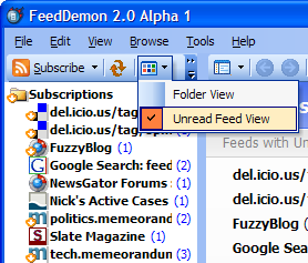
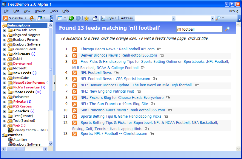
The first place I saw it was in screenshots for the upcoming release of Nick Bradbury’s excellent FeedDemon:
- This screenshot shows that the icon has been placed on the standard “Subscribe” button in FeedDemon. In my opinion, this usage is wrong. The icon means “subscribe to this feed” not “add a subscription and I’ll ask you for the URL in a minute”.
- This screenshot shows the icon incorrectly in place on the Subscribe button, but also shows the icon in its correct usage – as a link to subscribe to a feed in the list of feeds.
Nick is a smart guy and is unquestioningly a wonderful advocate for feed reading and feed technology – I hope he will reconsider the usage of the feed icon on the Subscribe button in FeedDemon.
Yesterday, I ran across this post in one of my “feedlounge” search feeds and went on to check out FeedShow. One of the things I was immediately struck by was the use of the FeedIcon. Again, I’m sure that FeedShow has only the best of intentions, however they are misusing the icon in both of the places I saw it in their application.
- The first place I noticed the icon was as the Subscribe button, just like FeedDemon. FeedShow has actually gone a step further than FeedDemon here and added a “modifier” icon to the Suscribe to Feed Icon. This is a bit of a double edged sword – the modification makes it more appropriate for its usage in this situation, however it also dilutes the meaning of the icon.
- The second place I found the icon was deeper in the tree control, as the “feed” icon. This is really a terrible usage of the icon. The icon means “subscribe…”, not “this is a feed”.
I’m not trying to knock the FeedShow folks – I’m sure that they have only the best of intentions. However, in their usage of the “Subscribe to Feed Icon”, they are actually damaging the icon’s usefulness.
This may not seem like a big deal, but it is.
Icon and user interface designers and even graphic designers are notoriously protective of the use of icons and “marks” like corporate logos – with good reason. A properly used icon/image/logo can be a powerful tool; alternatively, a casually misused icon quickly loses it’s meaning.
Street signs are a good example – when you see this:

You know that it means you’re turning onto a one way street. If the person putting up traffic signs decided:
Hmm, we want people to turn left here from this lane… what signs did I bring with me? Ah, here’s one – it shows an arrow pointing left, that should be good enough.
and put up the same “One Way” sign instead of a “Left Turn” sign:

the result would be people turning into the oncoming traffic lane and getting into head-on collisions!
I grant you that it’s unlikely anyone will die due to the misuse of the Subscribe to Feed icon, however the parallel is valid. In order for a icon or a sign to have meaning, it must be used in a consistent way.
For the “Subscribe to Feed Icon” to fulfill its promise, all of us (especially feed reader developers who desparetely want to make subscribing to feeds easier) have to be judicious in our usage of the icon.
It’s important.
This post is part of the project: FeedLounge. View the project timeline for more context on this post.
hmm. i agree with everything you said in theory and that it’s an important issue.
but as an outsider, my expectation is that the icon represents the feed itself, rather than the action of subscribing to the feed. on its own it’s more nouny than verby. could be that that’s what these developers were seeing, also. i think the “+” modifier badge on that one screenshot is pretty clear, if technically incorrect.
Perhaps the part I didn’t include is how Firefox and IE are using this icon. You see this icon in Firefox and IE when the displayed page has a feed. Clicking the icon will then subscribe to that feed.
Alex,
I do not completely agree with you about the meaning of the icon though I agree about your request for standards (I chose the Firefox icon before Microsoft did).
“[…]We all agreed that it’s in the user’s best interest to have one common icon to represent RSS and RSS-related features in a browser.[…]”, that what I read on the ‘rssteam’ blog. I agree with that and there is not action (subscribe) related to it.
Let’s consider a feed like any other file (.txt, .pdf, .gif,…). You can read, subscribe, delete, … will you provide a different icon for all these actions ? No. You will certainly provide an instance of the original icon or a contextual menu.
For ‘subscribe’, I chose to add a green ‘+’, others will certainly have more beautiful/meaningful icons (!) but the idea is here.
Hum, I see you are using the icon in your right side menu, but there is no subscribe action related to it ???
Ready to discuss (and modify my icons), I wish Feedlounge great success.
Thierry (FeedShow).
Hi Alex!
I fully agree with your opinion on the subscribe button. It’s a beautiful and unique sign and it should be used one way only for signicance.
Whats your take on discrimination between RSS 1, 2 and ATOM? Is it nescassary? What about the old well established buttons?
Thanks for a really good article on this matter.
Theirry–
Thank you for the thoughtful response, let me try to do the same.
I understand your interpretation and their loose definition, however I also see how it is currently used in Firefox (Hey! there’s a feed you can subscribe to here!) and (perhaps wrongly) am assuming it will be used the same in IE 7.
For FeedLounge, we are keeping the simple green plus/red X metaphor for adding and removing feeds. The icon and button represents the action, and the placement of the buttons make it clear that they apply to the feeds list.
This is true, at the moment. However all of the browser folks are working hard to make clicking a link work to hand off to the aggregator of your choice. Some browsers (Safari for example) already have semi-decent support for this. So I believe it is the proper usage, as it already does work as “Subscribe” in some browsers and others seem to be poised to follow suit.
Good thoughts and feedback, thanks for sharing them.
Petit–
I don’t think it is important to differentiate them. To use an analogy, it would be using different icons to differentiate plain text e-mails and HTML e-mails. The end user doesn’t care enough to warrent the added confusion.
You raise an excellent point, Alex – and it’s one I obviously hadn’t considered 🙂 You’re right that using the orange icon on FeedDemon’s subscribe button is confusing, given the way that icon is used elsewhere. I’ll change this before FeedDemon 2.0 goes into public beta.
At the same time, though, I want to use an icon for the toolbutton that clearly means “Subscribe” (for one thing, it re-inforces what the icon means). For this reason, I actually like the way FeedShow overlays the green plus – that differentiates it from the “normal” subscribe icon, yet is still recognizable.
Nick–
I understand and completely agree with this desire. However, I still believe that adding the “plus” to the icon dilutes the mark and is thus somewhat harmful.
I think that the “plus” on top of the icon that represents a feed (without a favicon) is probably a more appropriate choice.
It’s certainly not an “easy” situation, or we wouldn’t be having a discussion about it.
I think the RSS icon simply represents the concept “RSS feed.”
Not sure the analogy to traffic signs works for me – I think the icon is more abstract.
Alpha 7 Update
We’ve updated FeedLounge to alpha 7. This includes some pretty hefty changes:
Item Push – new items are now pushed to your browser (like Gmail). This means that counts should stay in sync properly as well. Y’all are going to love this f…
It’s notable that Matt Brett’s http://feedicons.com would seem (to me) to support my view: he identifies the icon as “…the identity of syndicated content…”
This is perhaps similar to the trefoil for radioactivity (☢) which simply means “radiation” – if additional information is needed, it is supplied by context or additional text or symbols.
Two years on and RSS is a pretty standard thing! Although to comment on your street signs example, the RSS icon is probably way more recognised since those road signs are more typical to the US 🙂